Get key performance insights at a glance.
The dashboard is the first thing that users see when they log in to the Unity Portal. It provides real-time, actionable insights into your organisation's performance and supports a variety of filters and several chart display modes.
The exact data displayed depends on the user's role.
By default, all data displayed is from the last 24 hours. You can change the date range across the entire dashboard or at the widget level using the drop-down. Your change will be applied automatically and the page data will be refreshed.
The possible date ranges are:
- Last 1 hour
- Last 7 hours
- Last 24 hours
- Last 1 day
- Last 7 days
- Last 30 days
By default, the data displayed is a combined total across all merchant groups, merchants, and sites that you have access to.
You can filter data by merchant group, merchant, or site across the entire dashboard or at the widget level. To do so, use the filter drop-downs and click Apply. The page will reload with the updated data.
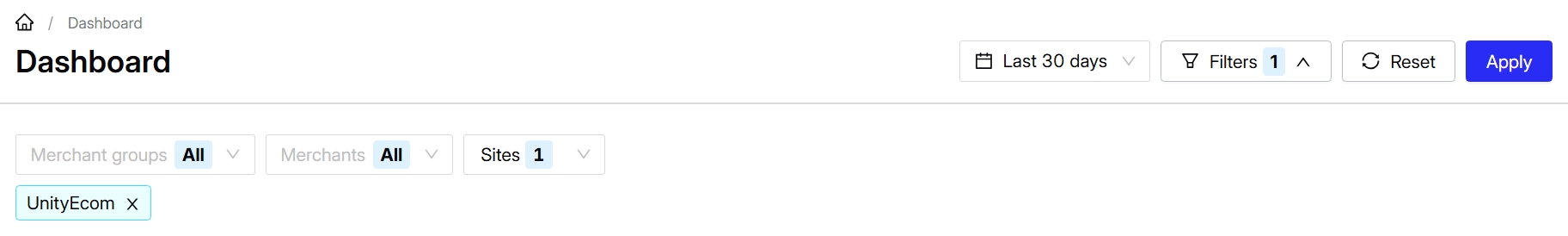
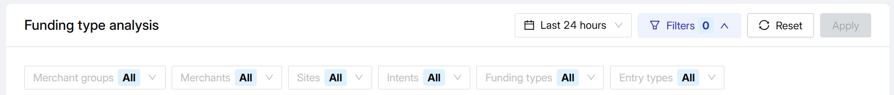
Widgets also support additional filtering by intent, funding type, and entry type.
You can zoom in on dashboard charts by using your mouse's cursor wheel or doing a pinch gesture on your trackpad. To return to the original size, click the - button in the top right.
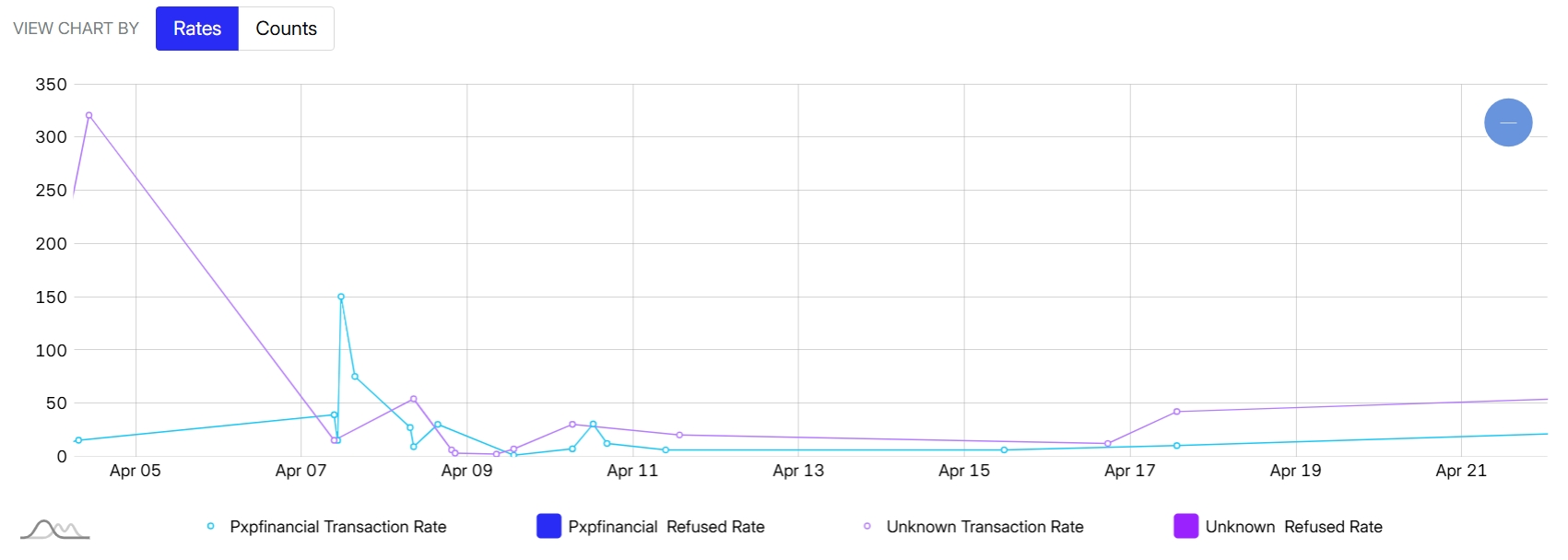
You can also hover over a specific data point to view exact numbers or dates.
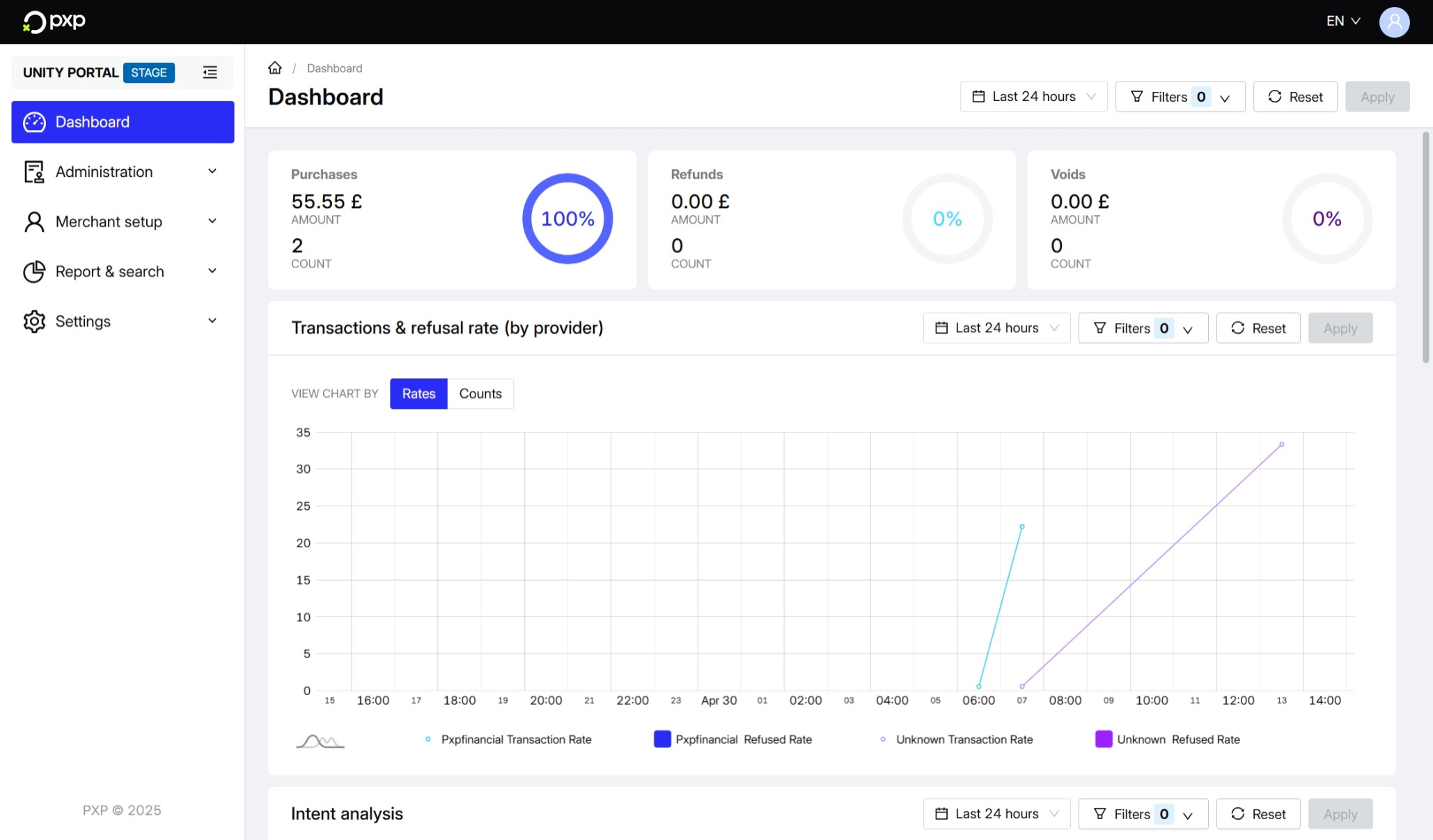
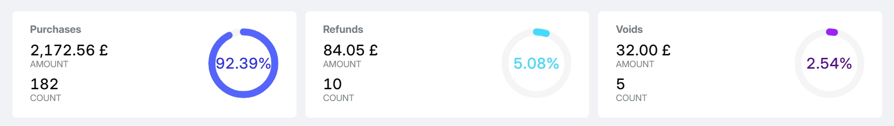
The three widgets at the top of the dashboard give you a quick overview into the amounts and counts of your purchases, refunds, and voids, as well as their percentage compared to your overall transactions.
The Transactions & refusal rate widget allows you to easily compare how different providers are performing.
By default, the chart shows the rates of the transactions and refusals by provider.
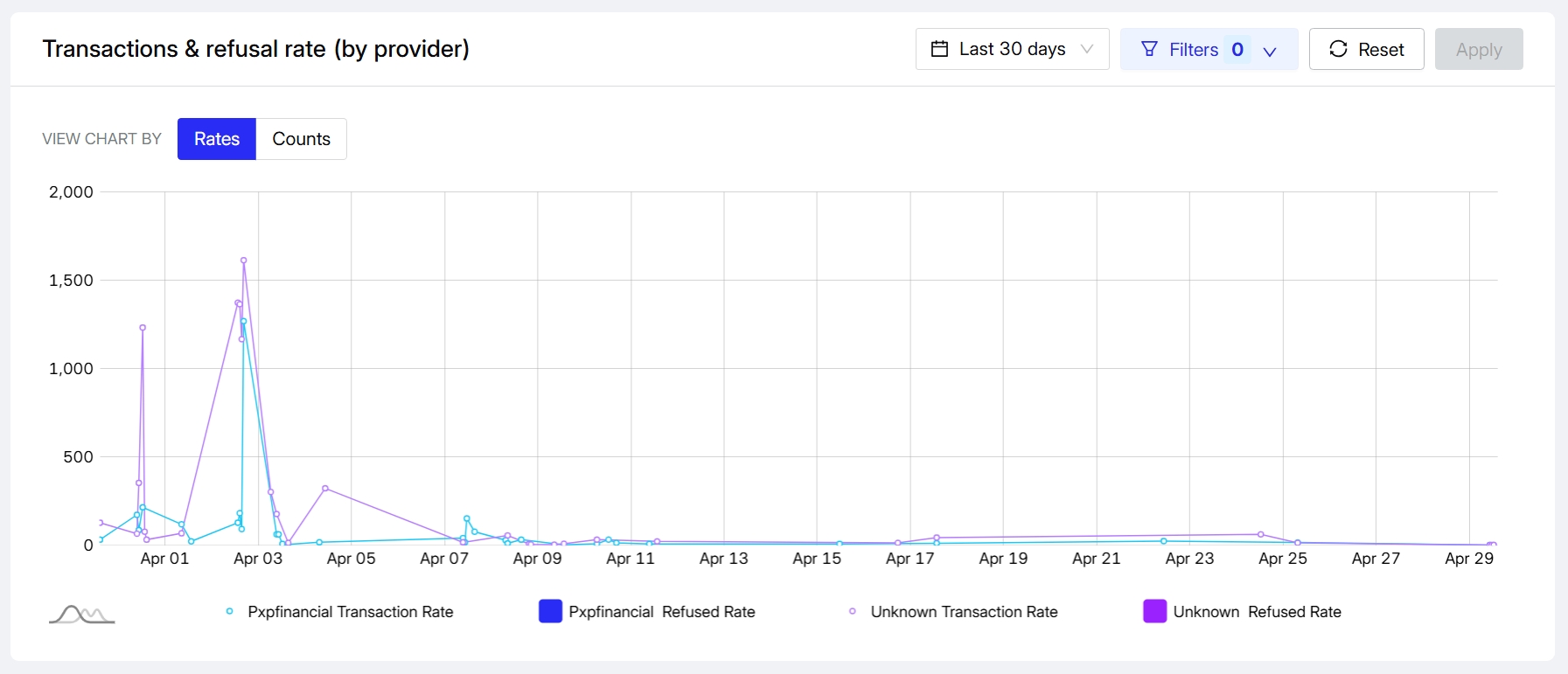
Choose the Counts view to see the numbers of transactions and refused transactions by provider.
The Intent analysis widget breaks down transactions by intent.
The possible intents are:
- Authorisation
- Estimated authorisation
- Incremental authorisation
- Payout
- Purchase
- Refund
- Void
By default, the chart shows the percentage of transactions for each intent.
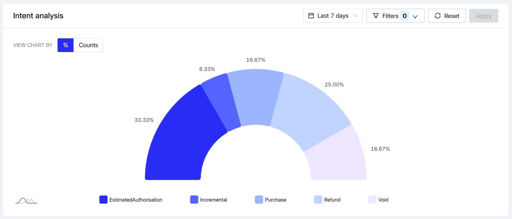
Choose the Counts view to see the number of transactions and the total transaction amount per intent.
The Funding type analysis widget allows you to understand how popular each funding type is.
By default, the chart shows the percentage of transactions associated with each funding type.
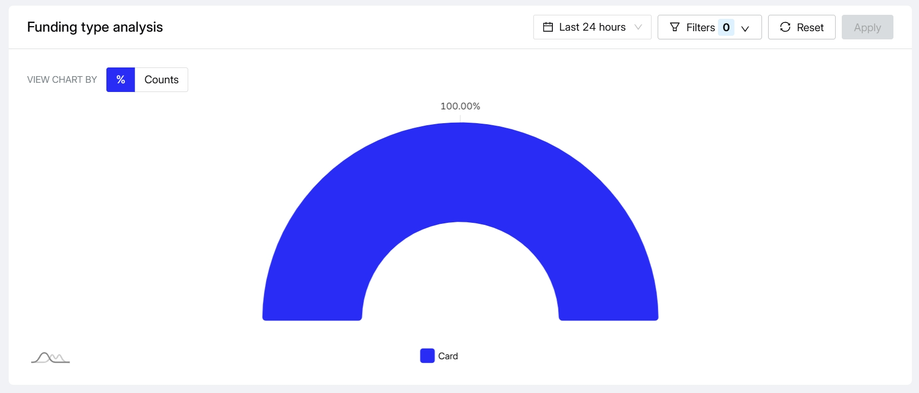
Choose the Counts view to see the number of transactions and the total transaction amount per funding type.
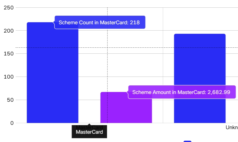
The Scheme analysis widget allows you to compare the volume of transactions processed across the different supported card schemes.
By default, the widget shows the percentage of transactions performed with each card scheme.
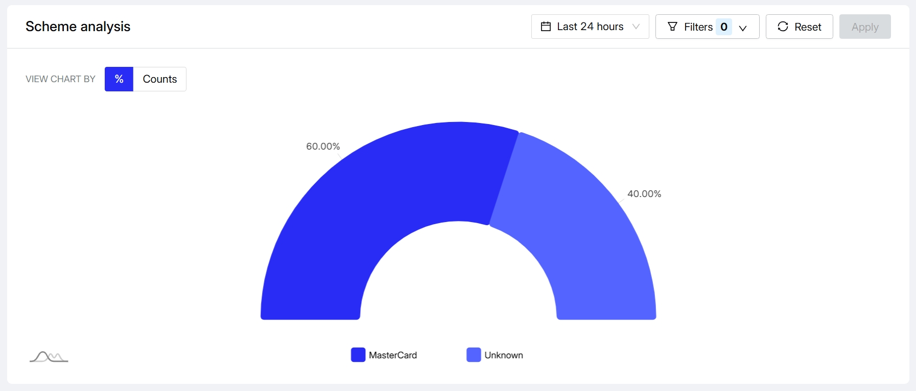
Choose the Counts view to see the number of transactions and the total transaction amount per scheme.
The DCC Statistics section includes three widgets that provide comprehensive insights into your Dynamic Currency Conversion performance, helping you understand customer behaviour, revenue impact, and currency preferences.
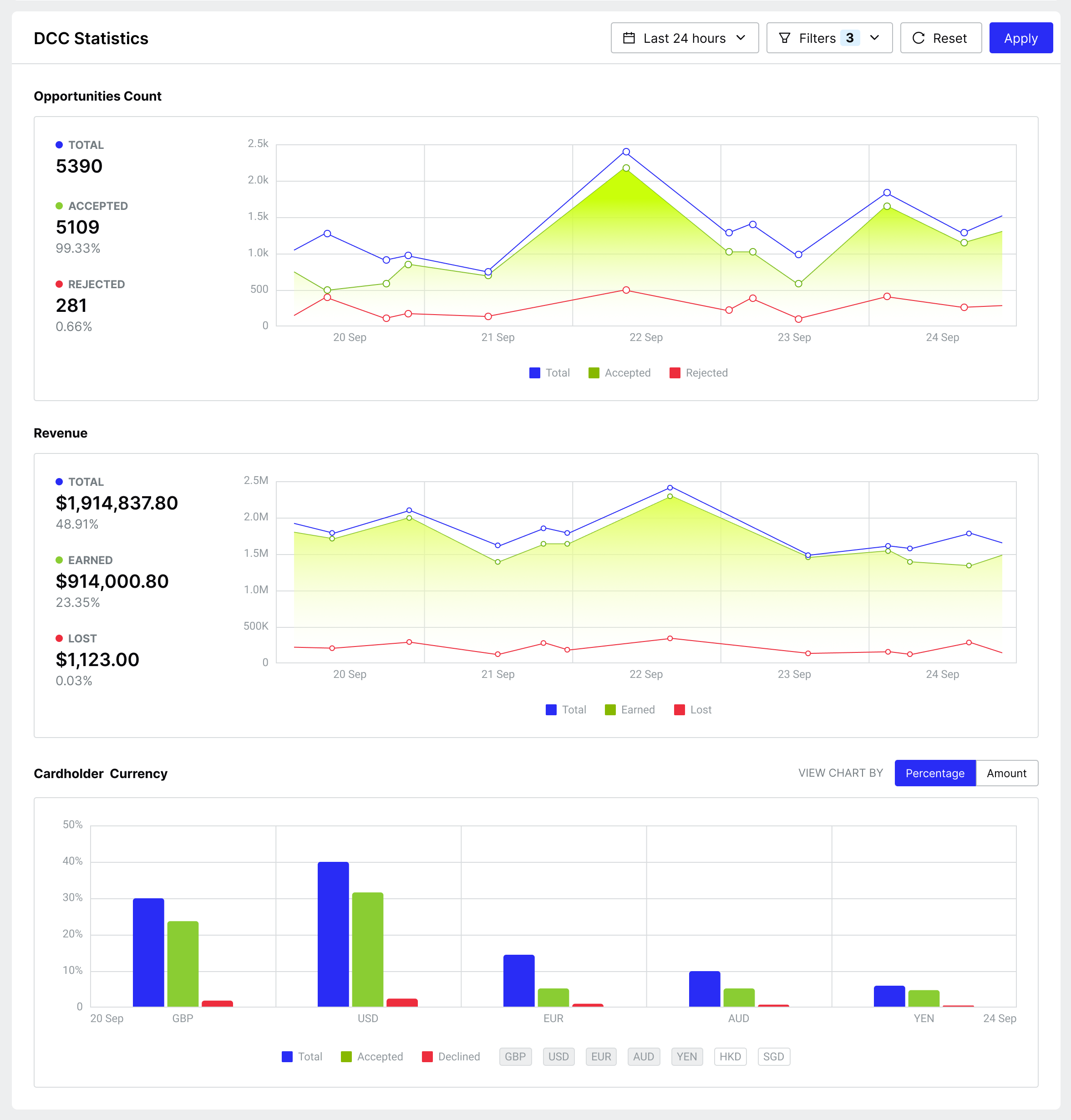
All metrics can be filtered by merchant group, merchant, site, intent, funding type, card type, FX provider, and transaction state giving you granular control over the data you're analysing.
The Opportunities Count widget allows you to understand your customers' attitude towards DCC over time. You can track the volume of DCC opportunities presented to customers and analyse their acceptance patterns.
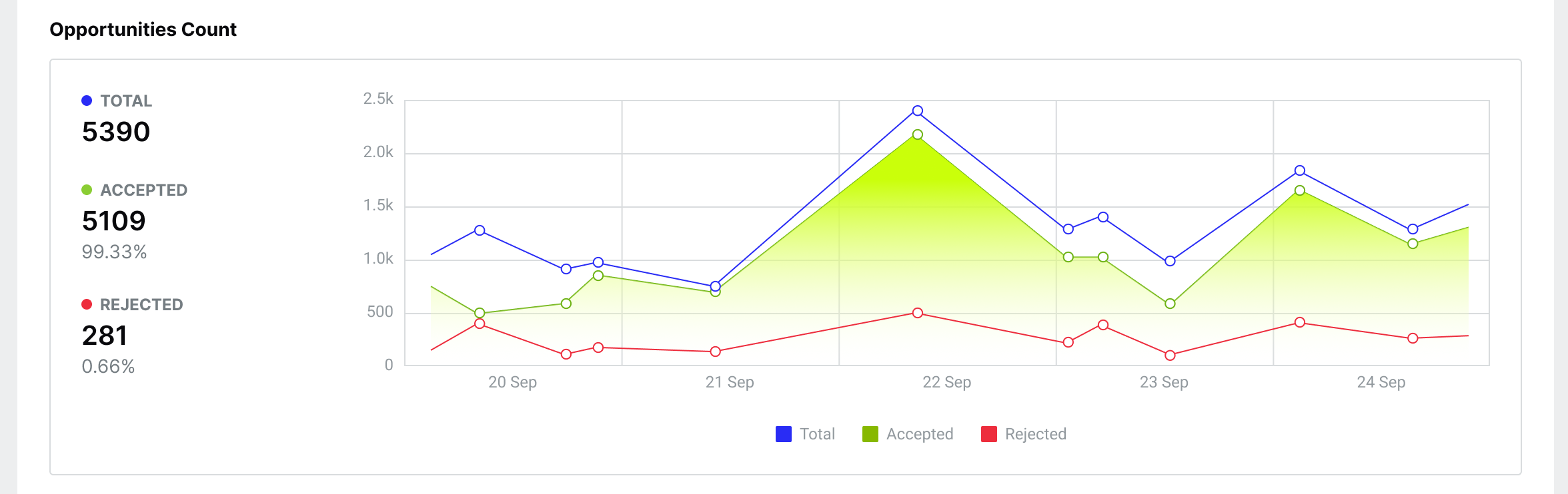
The widget shows three key metrics across your selected time period:
- DCC opportunities: The total number of transaction requests (purchases, authorisations, and estimated authorisations) where DCC was offered to the customer.
- Accepted opportunities: Transaction requests where the customer accepted the DCC rate, indicated by the DCC indicator.
- Rejected opportunities: Transaction requests where the customer rejected the DCC rate, indicated by the DCC indicator.
The Revenue widget allows you to see the potential impact of DCC on your organisation's revenue. Please note the figures are guidelines as you will need to adjust based on your organisation's commercial agreement with your acquirer. The widget allows you to track not only the mark-up revenue obtained from a transaction in your local currency, but also understand the potential revenue from declined offers.
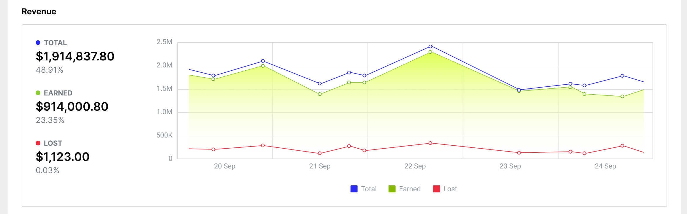
The widget shows three key revenue metrics across your selected time period:
- Revenue opportunities: The total potential markup revenue from all transaction requests (purchases, authorisations, and estimated authorisations) where DCC was offered to the customer. This accumulates the markup percentage amount for all DCC opportunities.
- Revenue earned: The approximate mark-up revenue generated from transactions where customers accepted the DCC rate, as indicated by the DCC indicator. This accumulates the markup percentage amount for all approved transactions where DCC was accepted and is then converted in your local currency.
- Revenue lost: The potential revenue from transactions where customers rejected the DCC rate or where the transaction was declined. This accumulates the markup percentage amount that could have been earned converted in your local currency.
The Cardholder Currency widget allows you to understand which currencies your customers use and how they respond to DCC offers. This information helps you track where your customers are based and identify which currencies generate the most DCC opportunities.
By default, the widget shows the percentage breakdown of cardholder currencies across all DCC transaction opportunities. For example, if you had 50,000 DCC transactions over 30 days, you might see 30% EUR, 20% USD, 14% GBP, and 36% AUD.
Within each currency segment, you can see the split between accepted and declined DCC offers. For instance, if GBP represents 14% of total opportunities, this might break down into 10% accepted and 4% declined.
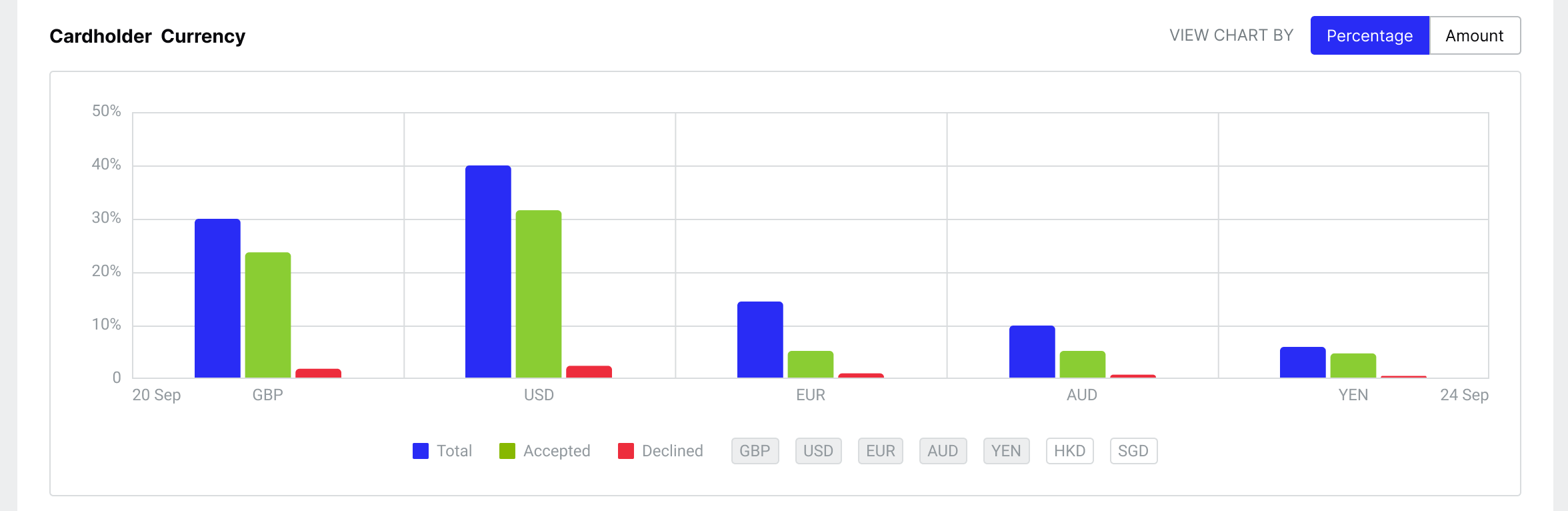
Choose the Amounts view to see the total transaction amounts per currency.