Learn about the different standalone components that we offer.
Capture billing address details using highly-customisable standalone input fields.
The address input field component allows you to:
- Customise the label copy.
- Customise the styling of the input field.

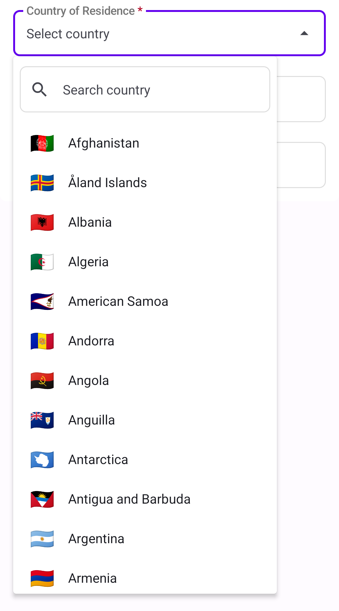
The country selection component allows you to:
- Customise the label copy.
- Customise the styling of the drop-down and drop-down options, depending on their state.
- Choose a message to display when no country is found.
The postcode input field allows you to:
- Customise the label copy.
- Customise the styling of the input field.

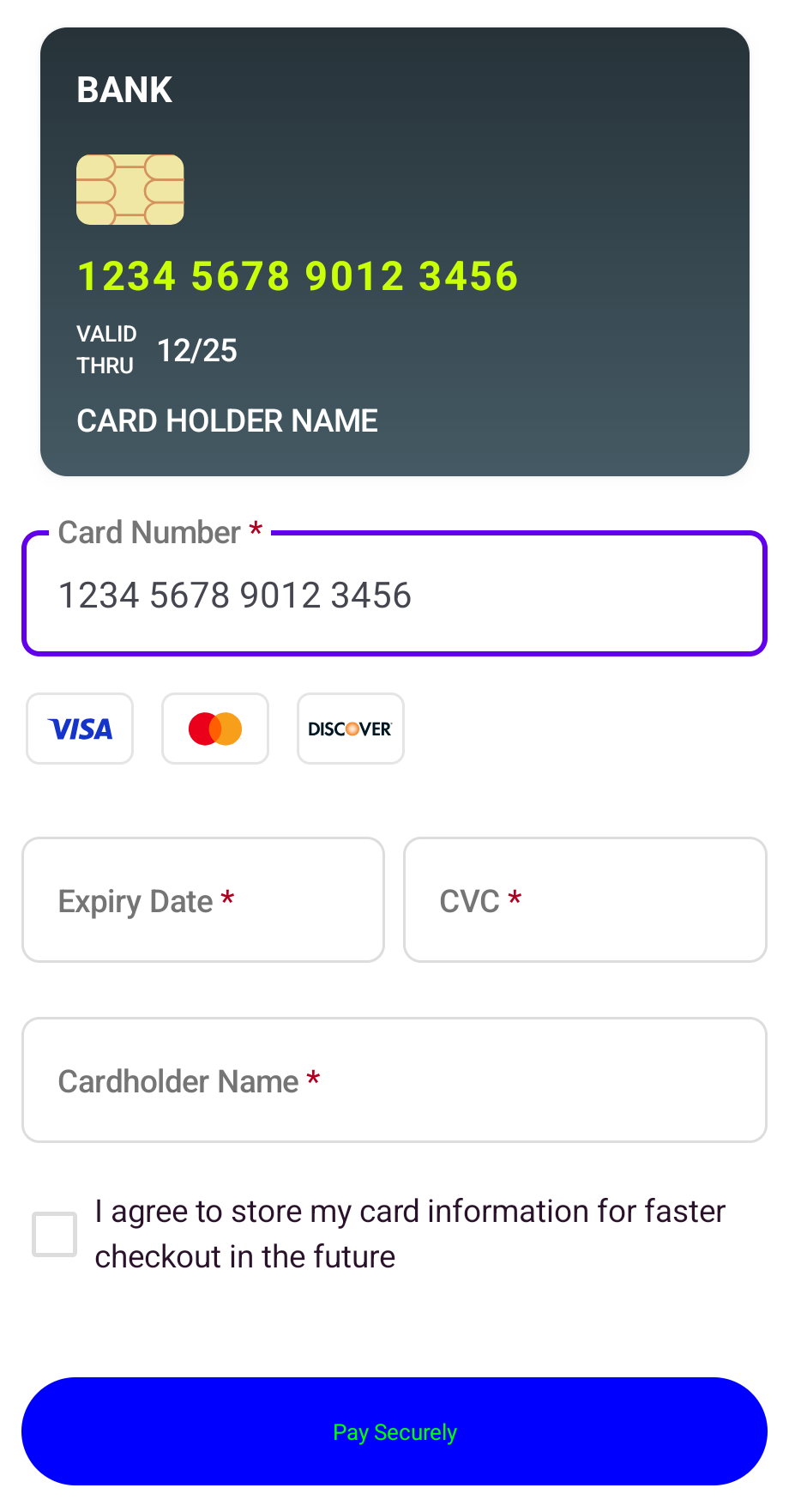
The card consent component allows you to:
- Customise the label copy.
- Add custom styling for the checked and unchecked versions of the checkbox.

Capture card details using highly-customisable standalone input fields.
The card brand selector component allows you to:
- Decide which cards to show/accept.
- Choose how cards appear when selected.
- Highlight the detected card brand as the customer types their card number.

The card consent component allows you to:
- Customise the label copy.
- Add custom styling for the checked and unchecked versions of the checkbox.


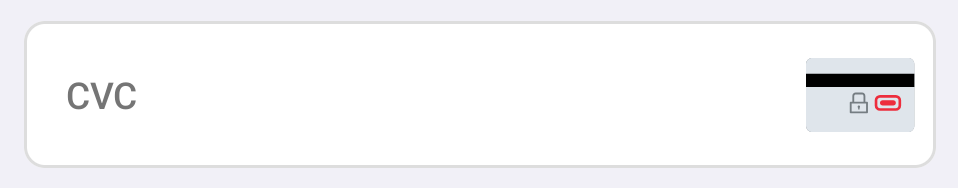
The card CVC component allows you to:
- Decide whether or not to mask the CVC.
- Add a toggle so cardholders can show or hide the CVC.
- Display a hint icon, with or without tooltip.
- Sync with the dynamic card component.

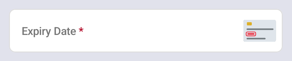
The card expiry component allows you to:
- Choose the expiry date format.
- Set an initial placeholder value.
- Display a hint icon, with or without tooltip.
- Sync with the dynamic card component.

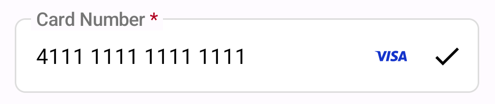
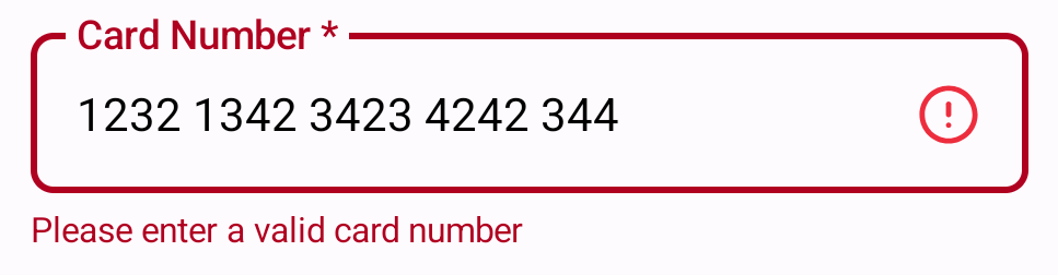
The card number field allows you to:
- Format the card number as the user types.
- Display the card scheme logo.
- Validate the card number on input change or input blur.
- Sync with the dynamic card component.

The cardholder name component allows you to:
- Set an initial placeholder value.
- Choose whether to convert the input to uppercase automatically.
- Display a hint icon, with or without tooltip.
- Sync with the dynamic card component.

Display a button to finalise the payment process.

The card submit component allows you to:
- Customise the button's text.
- Disable the button until all fields are validated or show a loading state.
- Show or hide the button based on validation status.
- Enable AVS (address verification) checks or skip if not needed.
You can also choose to use your own button instead of rendering the PXP button.
Display a live preview of a customer's card with dynamically updated information.
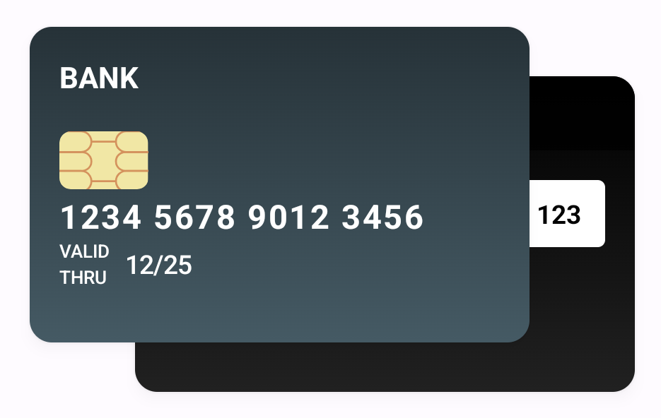
The dynamic card image component allows you to:
- Choose front and back images for the card preview.
- Customise the text labels and styles for the card fields displayed on the image.
- Dynamically update the card preview as the user types.